프로젝트/소규모 기능 구현
[React] Button Modal 만들기
harusari
2023. 7. 7. 22:41
목표
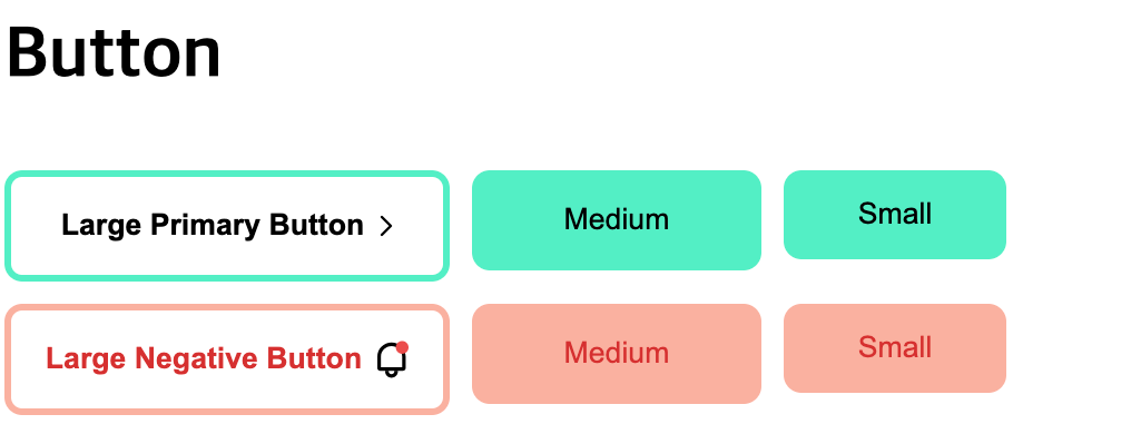
- 이렇게 생긴 Button 모달들을 최대한 재사용성이 가능하도록 만들기
프로젝트 초기 세팅
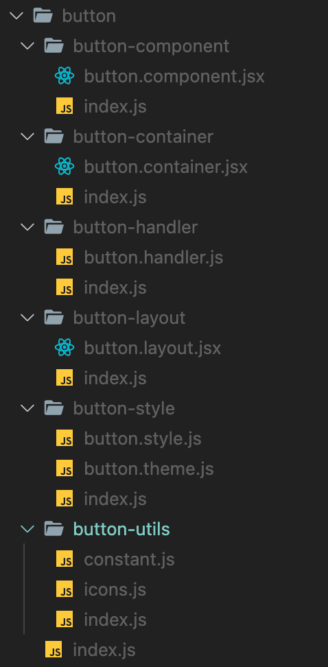
폴더 구조
 01
01
- src
- pages : 각각의 pages들이 담겨있는 폴더
- modals : modals pages 내부 요소들이 담겨있는 폴더
- button : button 관련 요소들이 담겨있는 폴더
- button-component : 재사용 가능한 UI 컴포넌트를 보관하는 폴더
- button-container : 여러 컴포넌트를 그룹화하여 관리하는 컴포넌트를 보관하는 폴더
- button-handler (혹은 hooks) : button관련 handler들이 담겨 있는 폴더
- button-layout : 페이지 레이아웃이나 큰 틀을 구성하는 컴포넌트를 보관하는 폴더
- button-style : 스타일링 관련 파일을 보관하는 폴더
- button.style.js : button 관련 styled-components들이 있음
- button.theme.js : button의 속성 및 색상에 따라 달라지는 theme 이 정의되어 있음
- button-utils : button관련 utils들을 모아둠
- constant.js : button관련 상수들을 정의한 파일
- icons.js : button관련 icons들을 담아둔 파일
- input : button 폴더와 내부 구성 구조 동일
- modal : button 폴더와 내부 구성 구조 동일
- select : button 폴더와 내부 구성 구조 동일
- button : button 관련 요소들이 담겨있는 폴더
- modals : modals pages 내부 요소들이 담겨있는 폴더
- redux : redux를 활용한 전역 상태 관리를 위한 폴더
- App.js : 어플리케이션의 진입점
- pages : 각각의 pages들이 담겨있는 폴더
파일별 기능
App.js
import { ThemeProvider } from "styled-components";
import { ButtonLayout, theme } from "./pages";

function App() {
  return (
    <ThemeProvider theme={theme}>
      <ButtonLayout />
    </ThemeProvider>
  );
}

export default App;
- <ThemeProvider theme={theme}>
- button.theme.js에서 정의한 theme들을 ButtonLayout에 전달하기 위함
- 이렇게 하면 ButtonLayout의 하위요소들에서 theme에 접근할 수 있음
- <ButtonLayout />
- button.layout을 보여줌
button-utils > constants.js
export const ATTRIBUTE_PRIMARY = "primary";
export const ATTRIBUTE_NEGATIVE = "negative";
export const SIZE_LARGE = "large";
export const SIZE_MEDIUM = "medium";
export const SIZE_SMALL = "small";
- 버튼의 두 가지 속성인 primary와 negative라는 String이 계속 반복될 것 같음
- 휴먼 에러를 방지하기 위해 constant로 선언해서 사용하기로 결정
- 마찬가지로, large, medium, small 사이즈에 따라 여러 요소들이 결정되고, 자주 사용할 것 같아 constant로 선언
button.layout.jsx
import { Layout, Title } from "../../styles";
import { BtnContainer } from "../button-container";
import { ATTRIBUTE_NEGATIVE, ATTRIBUTE_PRIMARY } from "../button-utils";

export const ButtonLayout = ({}) => {
  return (
    <Layout>
      <Title>Button</Title>
      <BtnContainer attribute={ATTRIBUTE_PRIMARY} />
      <BtnContainer attribute={ATTRIBUTE_NEGATIVE} />
    </Layout>
  );
};
- 위에서 정의한 constant를 사용
- 전체적인 Layout을 감싸주고, 그 안에 Title을 전달하고 두 개의 컨테이너를 불러온다
- 이 곳에 attribute prop으로 각각 primary, negative 속성을 전달하기만 하면 위에서 봤던 large, medium, small 버튼 묶음들을 가져올 수 있다
- 재사용성이 높도록 attribute속성만 전달하면 버튼 묶음을 가져올 수 있다!
- 이 곳에 attribute prop으로 각각 primary, negative 속성을 전달하기만 하면 위에서 봤던 large, medium, small 버튼 묶음들을 가져올 수 있다
- 이 곳에서 사용한 styled-component인 Layout, Title은 다음과 같다.
export const Title = styled.h1`
  display: block;
  font-size: 2em;
  margin-block-start: 0.67em;
  margin-block-end: 0.67em;
  margin-inline-start: 0px;
  margin-inline-end: 0px;
  font-weight: bold;
`;

export const Layout = styled.div`
  display: flex;
  flex-direction: column;
  gap: 10px;
`;
- Title은 약간의 스타일링이 가미된 h1태그이고, Layout은 flex속성과 내부 요소들을 column으로 정렬한다.
button.container.jsx
import { Container } from "../../styles";
import { ButtonComponent } from "../button-component";
import { handleButtonClick } from "../button-handler/button.handler";

import {
  ATTRIBUTE_NEGATIVE,
  ATTRIBUTE_PRIMARY,
  SIZE_LARGE,
  SIZE_MEDIUM,
  SIZE_SMALL,
} from "../button-utils";

export const BtnContainer = ({ attribute }) => {
  if (attribute === ATTRIBUTE_PRIMARY) {
    return (
      <Container>
        <ButtonComponent
          attribute={attribute}
          size={SIZE_LARGE}
          onClick={() => handleButtonClick(ATTRIBUTE_PRIMARY)}
        >
          Large Primary Button
        </ButtonComponent>
        <ButtonComponent attribute={attribute} size={SIZE_MEDIUM}>
          Medium
        </ButtonComponent>
        <ButtonComponent attribute={attribute} size={SIZE_SMALL}>
          Small
        </ButtonComponent>
      </Container>
    );
  }

  if (attribute === ATTRIBUTE_NEGATIVE) {
    return (
      <Container>
        <ButtonComponent
          attribute={attribute}
          size={SIZE_LARGE}
          onClick={() => handleButtonClick(ATTRIBUTE_NEGATIVE)}
        >
          Large Negative Button
        </ButtonComponent>
        <ButtonComponent attribute={attribute} size={SIZE_MEDIUM}>
          Medium
        </ButtonComponent>
        <ButtonComponent attribute={attribute} size={SIZE_SMALL}>
          Small
        </ButtonComponent>
      </Container>
    );
  }
};
- ButtonContainer는 세 개의 사이즈에 따른 버튼을 각각 가져와야 하므로 코드가 길 수밖에 없다
- layout에서 받아온 attribute 속성을 통해 if문으로 두 가지의 case를 분리한다
- primary 속성을 받은 경우와 negative 속성을 받은 경우로 구분된다
- Container 내부의 코드는 거의 동일한데, 똑같은 ButtonComponent를 불러와 props만 다르게 주는 모습이다.
- 이는 크게 세 가지의 size에 따라 구분된다 (large / medium /small)
- 따라서 ButtonComponent에는 전달받은 attribute와 size만 전달하면 해당하는 attribute, size에 해당하는 버튼 컴포넌트를 가져올 수 있다.
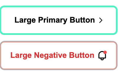
- size가 large일 때 onClick 요소가 걸려있는 걸 알 수 있는데, large의 버튼들을 누르면 다음과 같은 alert 혹은 prompt 창이 나온다.

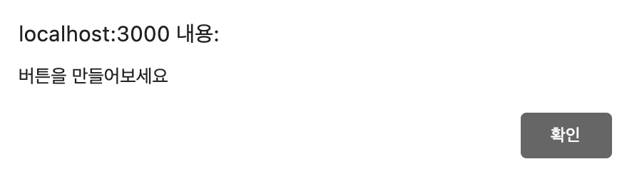 01
01
- 이를 구현하기 위함인데, 이와 관련된 로직인 handleButtonClick은 따로 handler 폴더에 빼두었다.
- 자식 컴포넌트에 prop으로 전달하는 이유는 실제 버튼 컴포넌트에 onClick으로 달아주어야 하기 때문이다.
button.handler.js
import { ATTRIBUTE_NEGATIVE, ATTRIBUTE_PRIMARY } from "../button-utils";

export const handleButtonClick = (attribute) => {
  if (attribute === ATTRIBUTE_PRIMARY) {
    alert("버튼을 만들어보세요");
  } else if (attribute === ATTRIBUTE_NEGATIVE) {
    let userResponse = window.prompt("어렵나요?");
  }
};
- primary일 때 버튼을 클릭하면 단순한 alert창이 나온다
- negative일 때 버튼을 클릭하면 사용자의 input을 받는 prompt창이 나온다
- 사용자가 prompt에 입력을 하고 확인버튼을 누르면 내용이 userResponse 변수에 저장된다
- 현재 사용자 input을 받아 정보를 저장해 사용하는 곳이 없어 useResponse는 사용되지 않고 있다
적용된 스타일
- 우선, Container는 자식 요소들을 가로로 정렬하고 사이에 간격을 두기 위한 스타일링을 진행하였다.
export const Container = styled.div`
  display: flex;
  flex-direction: row;
  gap: 10px;
`;
button.component.jsx
import { ButtonContentWrapper, ThemedButton } from "../button-style";
import { ATTRIBUTE_PRIMARY, NegativeIcon, PrimaryIcon } from "../button-utils";

export const ButtonComponent = ({ attribute, size, onClick, children }) => {
  return (
    <ThemedButton attribute={attribute} size={size} onClick={onClick}>
      <ButtonContentWrapper>
        {children}
        {size === SIZE_LARGE &&
          (attribute === ATTRIBUTE_PRIMARY ? (
            <PrimaryIcon />
          ) : (
            <NegativeIcon />
          ))}
      </ButtonContentWrapper>
    </ThemedButton>
  );
};
- ThemedButton은 button태그로 구성된 styled-component이기 때문에 onClick 핸들러로 props로 받아온 핸들러 함수를 전달해준다
- 그러면 비로소 alert 혹은 prompt가 실행되게 된다
- 여기서 이거 전달 안해주면 안 실행됨
- ButtonContentWrapper안에서는,
- 일단 받아온 children (=버튼 내부 글씨) 보여줌
- size가 large일 때만 각각 icon들이 보여지기 때문에, && 연산자를 통해 size check를 한다
- primary일 때는 primaryIcon이 보여지고, negative일때는 negative icon이 보여지게 된다
styled-components
이곳에서 사용한 styled-components가 꽤 까다롭기 때문에 하나하나 쪼개서 설명함
Wrapper들
export const ButtonContentWrapper = styled.div`
  display: flex;
  -webkit-box-align: center;
  align-items: center;
  -webkit-box-pack: center;
  justify-content: center;
  gap: 7px;
`;

export const IconWrapper = styled.div`
  display: flex;
  -webkit-box-align: center;
  align-items: center;
  -webkit-box-pack: center;
  justify-content: center;
`;
- 버튼을 둘러싸고 있는 ButtonContentWrapper
- flex 속성과 아이템들을 중앙정렬하기 위한 요소들이 정의되어 있다
- gap도 있음
- 아이콘을 둘러싸고 있는 IconWrapper
- 위와 별 다를 거 없다
button.theme.js
import {
  ATTRIBUTE_NEGATIVE,
  ATTRIBUTE_PRIMARY,
  SIZE_LARGE,
  SIZE_MEDIUM,
  SIZE_SMALL,
} from "../button-utils";

export const theme = {
  attributes: {
    [ATTRIBUTE_PRIMARY]: {
      color: "rgb(0, 0, 0)",
      borderColor: "rgb(85, 239, 196)",
      backgroundColor: "rgb(85, 239, 196)",
      activeBackgroundColor: {
        [SIZE_LARGE]: "rgb(238, 238, 238)",
        [SIZE_MEDIUM]: "rgb(0, 184, 148)",
        [SIZE_SMALL]: "rgb(0, 184, 148)",
      },
    },
    [ATTRIBUTE_NEGATIVE]: {
      color: "rgb(214, 48, 49)",
      borderColor: "rgb(250, 177, 160)",
      backgroundColor: "rgb(250, 177, 160)",
      activeBackgroundColor: {
        [SIZE_LARGE]: "rgb(238, 238, 238)",
        [SIZE_MEDIUM]: "rgb(225, 112, 85)",
        [SIZE_SMALL]: "rgb(225, 112, 85)",
      },
    },
  },
  size: {
    [SIZE_LARGE]: {
      height: "50px",
      width: "200px",
      fontWeight: "600",
    },
    [SIZE_MEDIUM]: {
      height: "45px",
      width: "130px",
      fontWeight: "400",
    },
    [SIZE_SMALL]: {
      height: "40px",
      width: "100px",
      fontWeight: "400",
    },
  },
};
- styled-component의 장점인 props 받는 거와 theme 적용할 수 있는 것을 최대한 활용해보고자 하였다.
- 우선 Theme부터 살펴보면
- 속성이 primary일 때와 negative일 때 color, borderColor, backgroundColor를 각각 가지고 있다
- 버튼을 눌렀을 때 적용되는 :active 속성이 있는데, 이건 이번에 처음 봐서 넘 신기했다
- :hover는 마우스를 hover했을 때 적용되었는데 이건 버튼을 눌렀을 때 적용된다
- 하여튼 각각 size에 따라 activeBackgroundColor가 달라서 또한 각각 정의했다.
- 또한 primary, negative와 상관없이 size에 따라 공통된 특성이 있었다
- 그것은 바로 height, width, fontWeight
- 이 또한 각각 적용하면 됨
- 아주 쉽지유?
ThemedButton
export const ThemedButton = styled.button`
  cursor: pointer;
  border-radius: 8px;

  color: ${(props) =>
    props.theme.attributes[props.attribute]?.color ||
    props.theme.attributes[ATTRIBUTE_PRIMARY].color};

  border: ${(props) =>
    props.size === SIZE_LARGE
      ? `3px solid ${
          props.theme.attributes[props.attribute]?.borderColor ||
          props.theme.attributes[ATTRIBUTE_PRIMARY].borderColor
        }`
      : "none"};

  background-color: ${(props) =>
    props.size === SIZE_LARGE
      ? "rgb(255, 255, 255)"
      : props.theme.attributes[props.attribute]?.backgroundColor ||
        "rgb(255, 255, 255)";

  &:active {
    background-color: ${(props) =>
      props.theme.attributes[props.attribute]?.activeBackgroundColor[
        props.size
      ] ||
      props.theme.attributes[ATTRIBUTE_PRIMARY]?.activeBackgroundColor[
        SIZE_LARGE
      ]};
  }

  height: ${(props) =>
    props.theme.size[props.size]?.height || props.theme.size.SIZE_LARGE.height};

  width: ${(props) =>
    props.theme.size[props.size]?.width || props.theme.size.SIZE_LARGE.width};

  font-weight: ${(props) =>
    props.theme.size[props.size]?.fontWeight ||
    props.theme.size.SIZE_LARGE.fontWeight};
`;
- 위에서 정의한 theme 덕분에 ThemedButton에서는 이를 잘 호출해 주기만 하면 된다
- 우선 기본적으로 styled-component가 props를 받는 방법
속성명 : ${(props) => props.프랍이름 ...}
- 이런 식으로 화살표 함수를 활용하면 된다. 개꿀!
- 돌아가서, 공통되는 cursor와 border-radius 속성부터 정의한다
- color
- 글자 색은 primary, negative로만 구분되기 때문에 theme에 해당 attribute를 전달해 일치하는 color를 반환하도록 하였다
- 만약 전달된 attribute 속성이 없으면 기본값은 primary일 때의 색상이다.
- 여기서 중요한 포인트, 바로 옵셔널 체이닝(= ?.) 이다
- ?. 앞의 속성이 존재하면 그것의 뒷 속성에 접근하라는 뜻
- 즉 여기에서는 props.theme.attributes[props.attribute] 객체가 존재하면 그것의 color 속성에 접근하라는 뜻
- 만약 해당 객체가 존재하지 않으면 null이나 undefined를 반환하고, 오류 발생함
- "Cannot read property 'color' of undefined" 같은 오류 메시지
- border
- size가 large일 때와 그 외의 경우의 border가 조금 다르기 때문에 size large의 경우는 따로 빼준다
- 그 외의 경우는 border가 없음!
- background-color
- border와 마찬가지로 size가 large일 때와 그 외의 경우가 다르기 때문에 삼항연산자를 활용한다
- 기본값은 large일때의 경우이다
- &:active
- 버튼을 클릭했을 때 적용되는 css이다
- 각각 정의해놓은 attribute, size에 따라 다른 css가 적용됨
- 기본은 large, primary일 때이다
- height, width, font-weight
- size에 따라서만 달라지므로, theme에서 각각의 size에 맞는 속성을 가져온다
- 기본값은 large이다
완성!

이제 요로코롬 이쁜 버튼 그룹들을 만날 수 있다! 히히